Ship complete
component states.
Auto-generate hover, focus, error, and disabled states with spec cards so designers, developers, and marketers stay aligned on design systems, handoff, implementation, launch, and campaigns.
Install StateBuilder — Free creates states · builds docs
Missing states slow every launch.
- Default-only components force developers to guess hover, focus, and disabled behavior during implementation.
- Spec cards drift after design system updates, so handoff and launch QA find mismatches.
- Manual state grids eat hours when campaigns need fresh UI fast.
The Spec Gap
When states are undocumented, developers rebuild behavior and marketers ship launches without edge cases.
"We caught missing focus states after launch because the docs never made it into the file."
Typical Result: Full state coverage in minutes
Watch StateBuilder generate UI states and specs
GIF: Select components -> Generate -> State matrix + spec card
Before/After: Missing states
Added 18 states instantly
Spec card preview
Handoff-ready documentation
Coverage summary
Trusted byDesign System TeamsProduct DesignersFrontend EngineersMarketing TeamsQA ReviewersDesign Ops
Three steps to complete specs.
1
Step 1: Select components
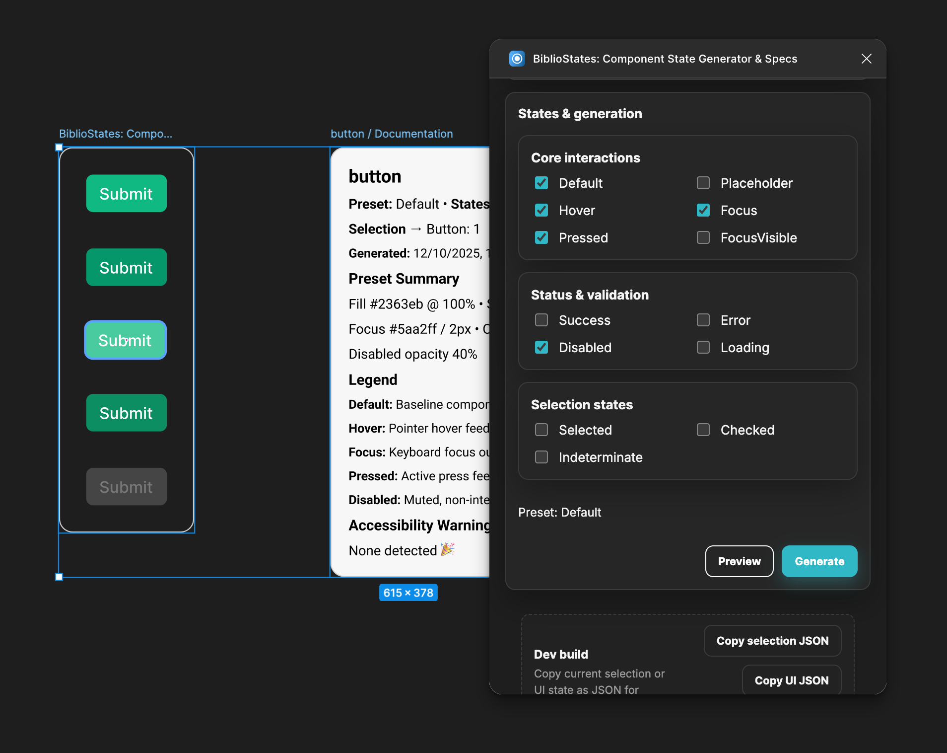
Select Components
Choose the components or variants you want to document. StateBuilder reads their structure.
2
Step 2: Pick state set
Pick States
Toggle the states you need, from hover and focus to error, disabled, and selected.
3
Step 3: Generate matrix + specs
Generate Specs
Create a grid of component states and documentation in seconds, ready for developer handoff.
Generate required states fast
Fill hover, focus, pressed, error, and disabled states instantly so every component ships complete.
- Supports variant sets and component properties
- Keeps spacing and tokens aligned with design systems
- Produces a matrix ready for launch QA
Screenshot: State generation panel
Spec cards for developer handoff
Generate a documentation frame with state notes so developers can implement the exact behavior.
Screenshot: Spec card layout
Surface missing states before launch
StateBuilder surfaces gaps in your state coverage so handoff stays clean and implementation stays accurate.
Screenshot: Missing state alerts
Built for design system and launch work.
Design System Release
Problem: Variants drift after token updates.
Result: Complete state grid ready for handoff.
Before: Missing states
After: Full matrix
Campaign Launch QA
Problem: Marketing assets miss edge states.
Result: Launch-ready UI across channels.
Before: Unverified states
After: QA ready
Generate states once, ship everywhere.
Install StateBuilder to create component state grids and documentation so designers, developers, and marketers stay aligned through handoff, implementation, launch, and campaigns.
Install StateBuilder — FreeStateBuilder Plugin Icon
Specs Ready
Watch StateBuilder generate UI states and specs
What states does StateBuilder generate?
Generate hover, focus, pressed, error, and disabled states, plus optional success or selected states based on your component.
Does it work with any design system?
Yes. StateBuilder works with any Figma components and is tuned for design system variants.
Can I choose which states to include?
Yes. Pick the states you need before generation, then review the matrix before handoff.
Is StateBuilder live?
Yes. Install it from Figma Community and generate your next state matrix.
Launch-ready states, every time.
Keep implementation and handoff aligned with clear documentation that supports campaigns and product launches.
Want to audit your design system for errors? Audit your design system with ComponentQA