Best Practices for Effective Design System Guidelines
Ever feel like your product design is a wild garden, with different teams planting whatever they like? You're not alone. The bigger a product or team gets, the messier things can become without a clear map.
That's where a design system comes in. And here's the thing: a design system is only as good as its guidelines. Let's dive into making those guidelines truly shine.
1. Introduction: The Foundation of Cohesive Design
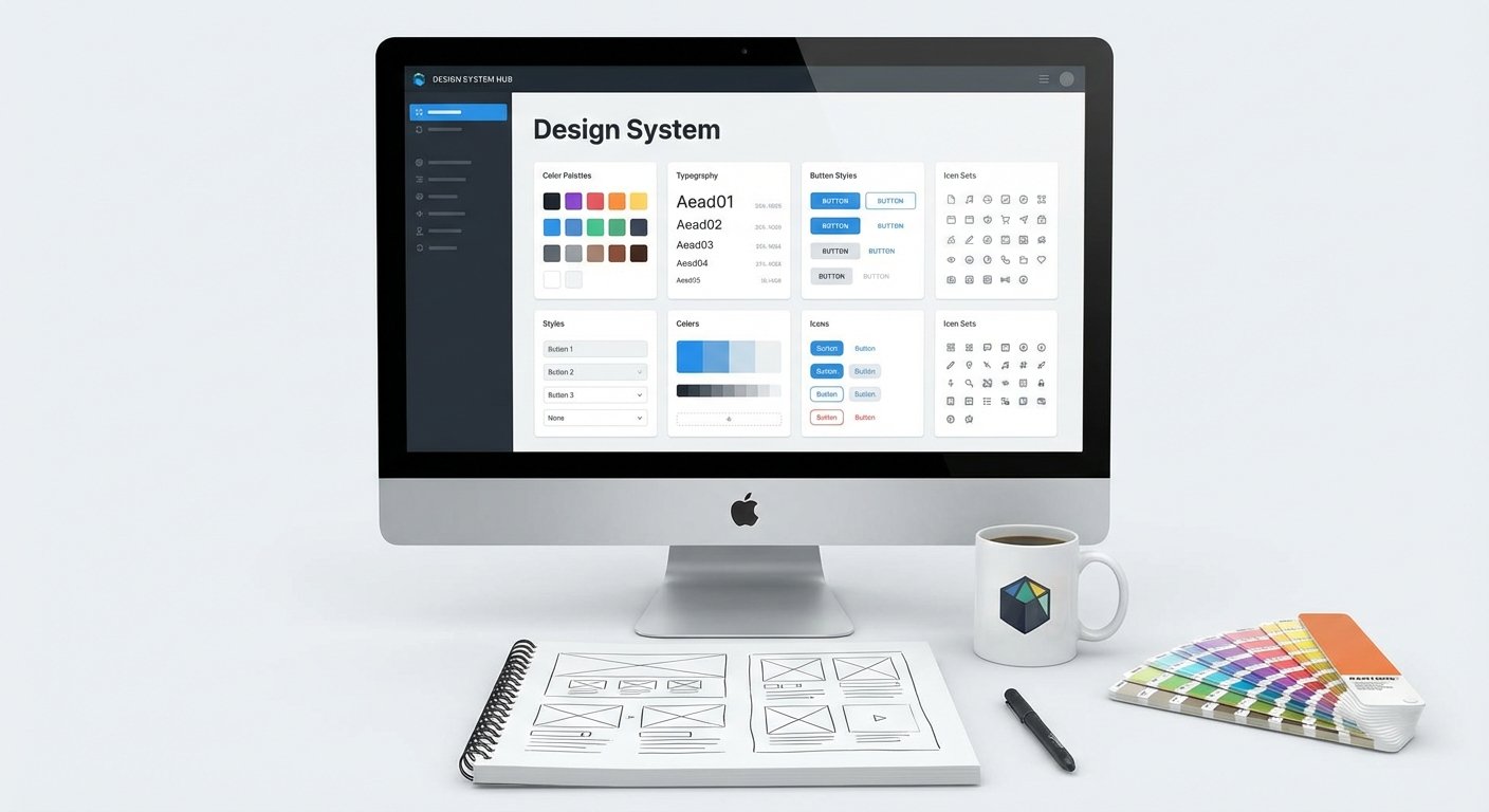
So, what exactly is a design system? Think of it as a comprehensive toolkit and a shared language for your entire product team. It's not just a UI kit; it's a living collection of reusable components, guided by clear standards, that can be assembled together to build any number of applications.
Why are effective guidelines so crucial, you ask? Without them, you're looking at inconsistency across your products, slower development cycles, and a whole lot of wasted time. Good guidelines mean everyone's on the same page, ensuring scalability and a consistent user experience.
And in today's world, Figma has become the undeniable central hub for this work. Its collaborative nature and powerful component libraries make it the perfect home for building and maintaining modern design systems.
2. Core Principles for Robust Design System Guidelines
Creating guidelines isn't just about dumping information. It's about designing the information itself. Here are the core principles to keep in mind.
Clarity and Conciseness
Nobody wants to read a novel to figure out how to use a button. Your guidelines need to be crystal clear and straight to the point. Use simple language, avoid jargon, and get to the "what" and "how" quickly.
Accessibility and Discoverability
What good are guidelines if no one can find them? Make sure your documentation is easy to access, search, and navigate. Think about who will be using it - designers, developers, product managers - and make it work for everyone.
Flexibility vs. Rigidity
It's a tightrope walk. You want consistency, but you don't want to stifle creativity or make the system impossible to adapt. Strike a balance between strict rules for core components and enough flexibility for unique use cases. A design system is a guide, not a prison.
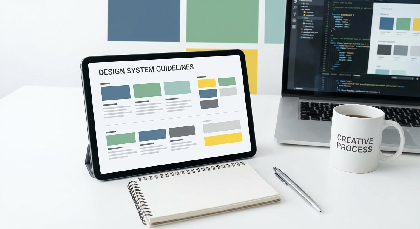
Living Documentation
A design system is never truly done. Emphasize that your guidelines are living documents, always ready for updates and improvements. Static documentation is dead documentation.
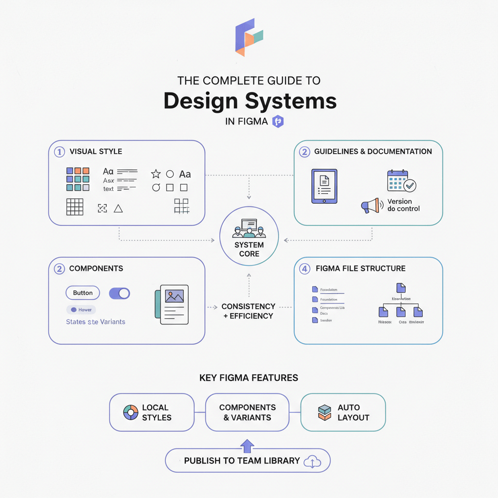
3. Essential Components to Document in Your Design System
Now, what exactly should you be documenting? These are the building blocks that make up your digital experience.
Design Tokens
These are the atomic bits of your system: your color palette, typography scales, spacing units, and even shadows. Documenting their values and proper usage ensures a single source of truth for your entire product's aesthetic.
Components
This is where the magic happens for your UI elements. Think buttons, cards, input fields, modals. Document their various states (hover, active, disabled), different variations, and, critically, clear instructions on when and how to use them.
Patterns
Components are great, but how do they fit together to solve common user problems? Patterns define reusable UI flows and interaction models, like how a user logs in, completes a form, or filters a list. This guides consistent user journeys.
Content Guidelines
Often overlooked, content is king. Document your brand's tone of voice, preferred terminology, and key messaging principles. This ensures your words are as consistent as your pixels.
Accessibility Standards
Inclusive design isn't a bonus; it's a must-have. Embed accessibility standards right into your guidelines from the start. This includes guidance on color contrast, keyboard navigation, screen reader compatibility, and more.
4. Crafting Clear and Actionable Documentation
Having the content is one thing; presenting it effectively is another. Good documentation isn't just informative; it's usable.
Structure and Hierarchy
Organize your information logically, just like a well-designed website. Use clear headings, subheadings, and a consistent navigation scheme. This helps users quickly find what they need without getting lost.
Visual Examples and Demos
Show, don't just tell. Include plenty of visual examples of components in various states and contexts. Interactive demos can make a huge difference in understanding how things actually work.
Code Snippets and API References
To bridge the gap between design and development, provide readily available code snippets and API references for your components. This streamlines the handoff process and ensures developers implement designs correctly.
Dos and Don'ts
Sometimes, knowing what not to do is as important as knowing what to do. Include practical Dos and Don'ts that illustrate common pitfalls and best practices for applying your system's elements.
Version Control and Change Logs
Transparency is key. Implement version control for your guidelines and maintain a clear change log. This helps everyone understand what's new, what's changed, and why, fostering trust and keeping things up to date.
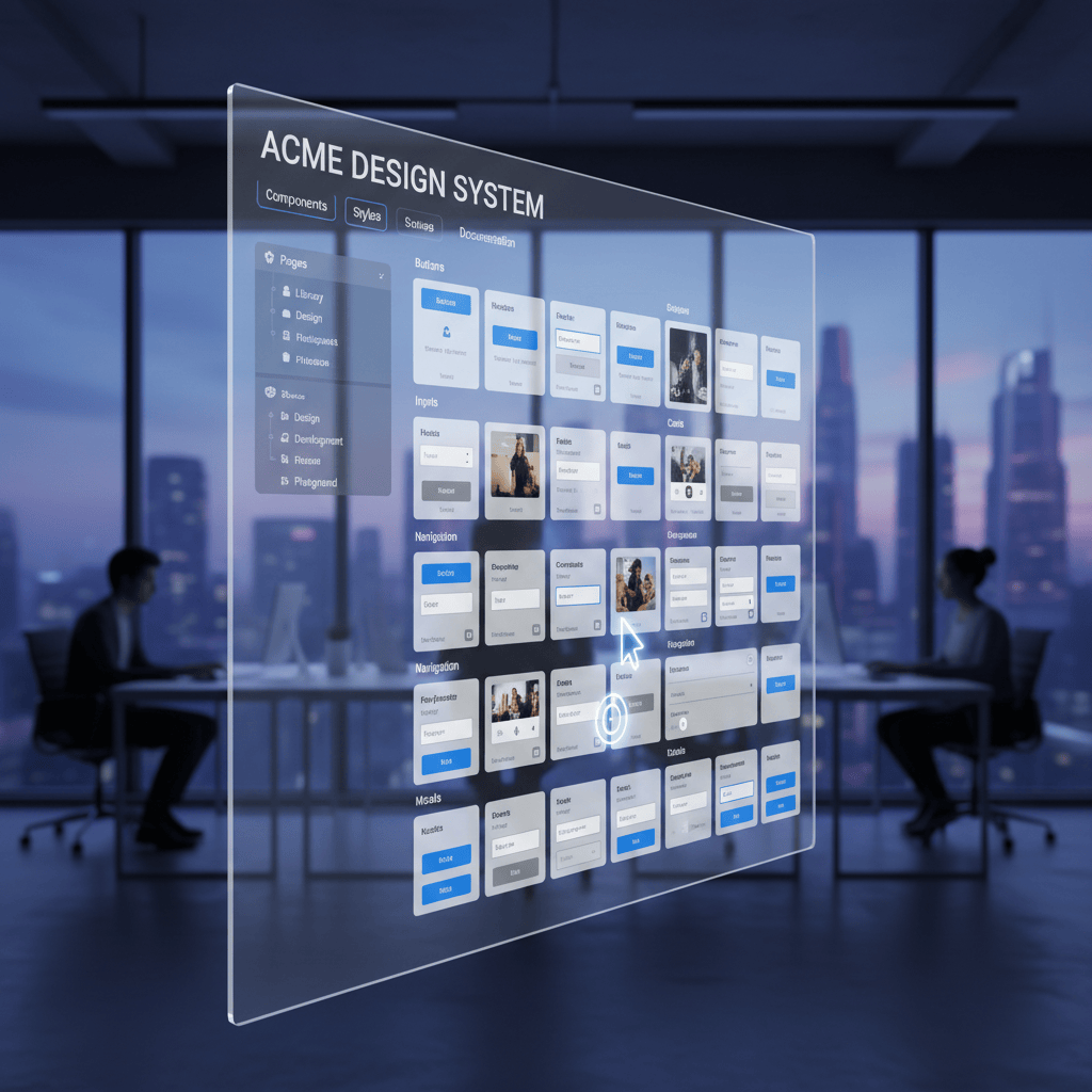
5. Tools and Workflows for Design System Management in Figma
Figma truly shines when it comes to design systems. It's more than just a drawing tool; it's a powerful collaborative environment.
Figma as a Central Hub
Leverage Figma's libraries to create a single source of truth for your components and styles. Its real-time collaboration features mean everyone is always working with the latest versions, reducing design drift and confusion.
Maintaining Consistency and Quality Assurance
Keeping a design system clean and consistent requires vigilance. Regularly auditing your files and libraries is critical to prevent inconsistencies from creeping in. Think about setting up routines for checks.
Leveraging Figma Plugins for Enhanced Management
This is where things get really efficient. There are incredible plugins to help you maintain your system's health. Use BiblioAudit - Find Detached Instances & Design System Check to identify and fix detached instances before they undermine your system.
And for streamlining the documentation of component states, tools like BiblioStates - Component State Generator & Specs are game-changers. They help you efficiently generate component states and create detailed specs, making developer handoff a breeze.
Integration with Development Workflows
Your design system doesn't live in a vacuum. Integrate it with your development workflows by connecting Figma libraries to code repositories. Tools that automate token extraction or component generation can bridge the gap, ensuring what designers build is what developers ship.
6. Adoption, Governance, and Maintenance
A design system isn't just a project; it's a product in itself. And like any product, it needs nurturing.
Onboarding and Training
Don't just launch your design system and expect everyone to magically use it. Invest in onboarding and training so teammates know how to navigate, understand, and contribute.
Establishing a Governance Model
Who owns the design system? Who makes decisions about new components or changes? Establish a clear governance model with defined roles, responsibilities, and a decision-making process to prevent chaos and ensure accountability.
Feedback Loops and Contribution Models
Encourage your team to be active participants. Create clear feedback loops so users can report issues or suggest improvements, and set a contribution model that empowers designers and developers to propose new additions or enhancements.
Regular Audits and Updates
Remember, it's living documentation. Schedule regular audits to review the system's effectiveness and identify areas for improvement. Keep it current, relevant, and aligned with your product's evolving needs.
7. Measuring the Success of Your Design System
How do you know if all this effort is actually paying off? You have to measure it.
Key Performance Indicators (KPIs)
Think about what success looks like. Are teams building features faster? Is there less design debt? Track KPIs like design consistency scores, development efficiency gains, adoption rates across teams, and time saved in design and development.
Gathering User Feedback
Don't guess; ask. Conduct surveys, interviews, and usability tests with the actual users of your design system - your designers, developers, and product managers. Their insights are invaluable for identifying pain points and opportunities for improvement.
Iterative Improvement
Armed with feedback and data, continuously iterate on your guidelines and the system itself. Design systems are not set-and-forget; they're living, breathing entities that need constant care and adaptation based on real-world insights.
8. Conclusion: The Continuous Journey of Design System Excellence
We've covered a lot, from foundational principles to specific tools and ongoing maintenance. Building an effective design system with robust guidelines is a journey, not a destination.
By prioritizing clarity, accessibility, and flexibility, documenting essentials thoroughly, and leveraging powerful tools like Figma and its ecosystem of plugins, you're setting your team up for success. A well-maintained design system isn't just about pretty pixels; it's about accelerating innovation, fostering collaboration, and delivering consistent, high-quality experiences to your users.
So, roll up your sleeves, embrace the continuous evolution, and enjoy the ride toward design system excellence. The future of product development is cohesive, efficient, and powered by smart systems.
FAQs
Frequently Asked Questions
Quick, action-focused answers pulled from this playbook so you can apply it faster.
How do I keep design system guidelines discoverable for every team?
Host docs where teams already work (Figma, Confluence, GitHub), keep navigation layered by tokens/components/patterns, and publish a change log so designers, developers, and marketers can search and trust the latest guidance.
What governance model should we start with?
Name a small core crew (design, engineering, PMM), set an intake lane for requests, and run a weekly review with clear go/no-go criteria. Publish contribution rules so teams can propose updates without slowing delivery.
Which metrics prove the design system is working?
Track component/library adoption, time saved on new features, defects tied to inconsistent UI, and audit results (like detached instances resolved). Pair that with sentiment surveys so you see speed plus satisfaction.
How do we prevent detached instances and drift in Figma?
Audit libraries weekly with BiblioAudit to catch detached instances, lock/publish libraries on a cadence, and keep contribution guidelines tight. Use BiblioStates to generate state specs so engineers ship what designers expect.
Learn
Design Ops Fundamentals
We built this evergreen mental model so designers, developers, and marketers can align design systems, handoff, implementation, launch, and campaigns.
Read the guideNext & previous

Related articles
The Complete Guide to Design Systems in Figma (2026 Edition)
Upgrade Figma design systems for 2026 with variable-first architecture, AI cleanup, and Code Connect to scale without drift.
Design Systems • 6 min read
The 2026 Shift: Bridging the Gap Between Design and Dev
Close the 2026 design-dev gap with five component library shifts that align tokens with production code.
Design Systems • 5 min read
The Ultimate Figma Plugin Stack: 8 Tools to Save You Hours Every Week
Install 8 Figma plugins that cut renaming, cleanup, and docs time so your team saves hours every week.
Figma Plugins • 4 min read