The 2026 Shift: Bridging the Gap Between Design and Dev
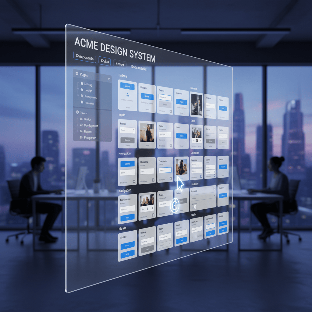
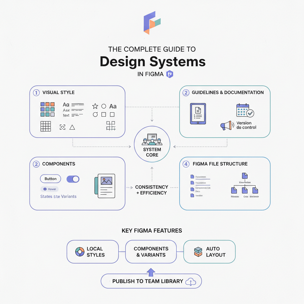
In the early days of product design, a "component library" was often just a glorified sticker sheet—a static page of buttons and inputs that designers would copy-paste until they inevitably broke. But as we move deeper into 2025, the definition of a design system has fundamentally changed.
We are no longer just drawing pictures of software; we are architecting logic.
The shift for 2025 is distinct: Logic-Driven Systems. The most successful teams this year aren't just focusing on how a component looks, but how it behaves and connects to the codebase. It’s about closing the loop between the Figma canvas and the React (or Vue/iOS) repository, ensuring that the "source of truth" isn't a myth, but a technical reality.
Here are the 5 key trends defining high-performance component libraries in 2025.
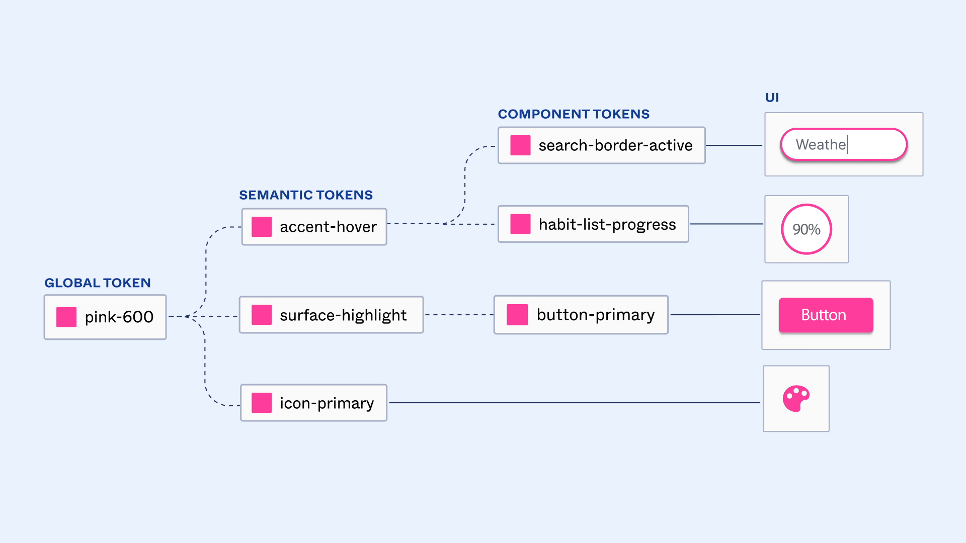
Trend 1: Variables Are The New Standard
If you are still relying solely on "Styles" for your colors and typography, your system is officially running on legacy tech. The industry standard has shifted aggressively toward Variables (Figma’s native implementation of Design Tokens).
Unlike static Styles, Variables allow for logic. They bridge the gap between design intent and code implementation by treating design decisions as data, not just visual properties.
Multi-Mode Magic
The real power of Variables lies in Modes. In 2025, we are seeing systems that support multi-brand and multi-theme architectures instantly.
- The Old Way: Manually creating a "Dark Mode" version of every single button variant.
- The 2025 Way: Toggling a single "Mode" switch on a parent frame, which instantly re-maps every child component from Brand-A-Light to Brand-B-Dark without swapping a single component instance.
💡 Actionable Tip
Adopt a structured naming convention that prioritizes semantics over description.
- ❌ Don't use: Blue-500
- ✅ Do use: bg-action-primary
This ensures that if your brand color changes from blue to purple next year, you update one token value, and the entire system—and the code referencing it—updates automatically.
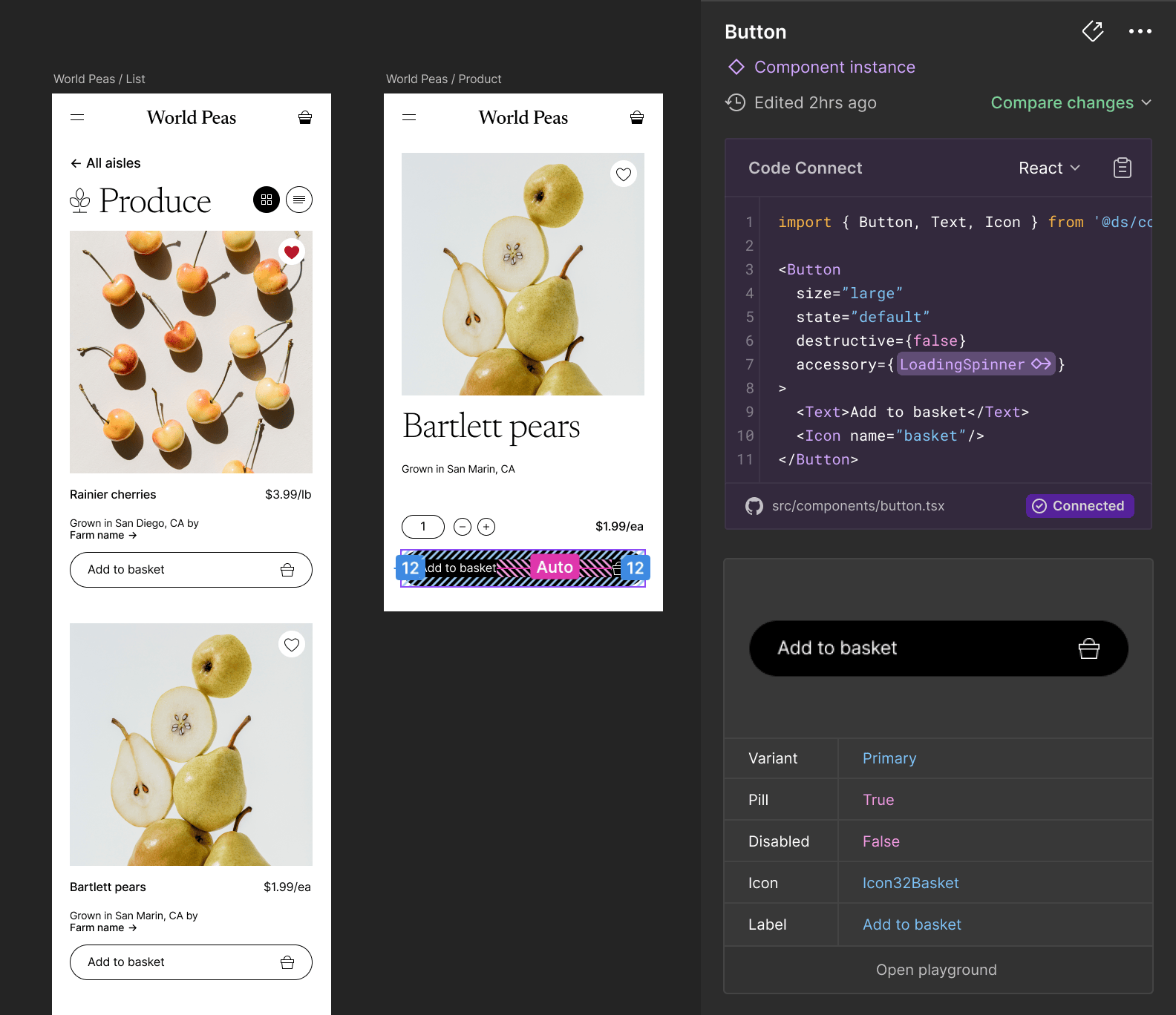
Trend 2: Code Connect & Dev Mode
The "hand-off" process has traditionally been a source of friction, where designers toss screenshots over a wall and developers guess the CSS values. Figma’s Code Connect (significantly updated in late 2024/early 2025) has dismantled this wall.
Closing the Gap
Code Connect allows you to link your Figma components to the actual code in your repository. When a developer inspects a component in Dev Mode, they don't see generic CSS auto-generated by Figma. They see your actual production code snippet—imports, props, and all.
A New Source of Truth
This shift moves the "single source of truth" closer to the code. The design file becomes a visual browser for the codebase. If the code changes, the snippet in Figma updates, ensuring that what designers are using matches exactly what developers are building.
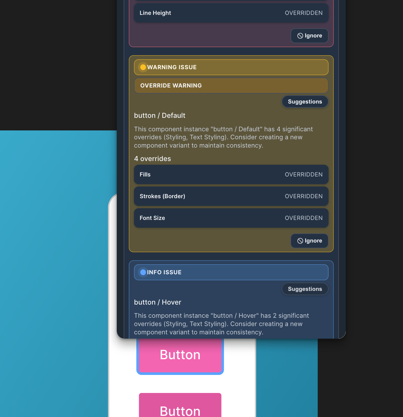
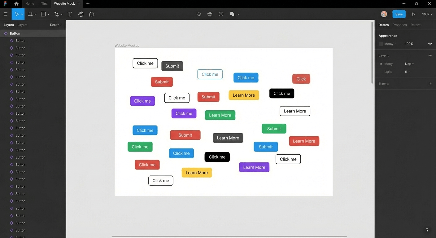
Trend 3: System Health & Governance
One of the biggest silent killers of design systems is "drift." This happens when designers detach instances, hard-code hex values, or override styles manually because "it’s just a quick fix." Over time, your sleek library becomes a messy graveyard of one-off decisions.
The Maintenance Nightmare
You can’t fix what you can’t see. Most Design Ops teams spend hours manually opening files to check if teams are actually using the new library updates. In 2025, governance is becoming automated.
🛠️ Tool Recommendation: Component Auditor Toolkit
If you manage a library, you need visibility. I highly recommend checking out the Component Auditor Toolkit.
- What it does: It scans entire files or pages to identify every instance of a component. Crucially, it flags detached instances and overridden styles.
- Why it matters: Instead of guessing which teams are ignoring the system, you get a clear report. It helps you pay down technical debt by pinpointing exactly where the "mess" is, allowing you to enforce compliance without being the "bad cop" who manually hunts for errors.
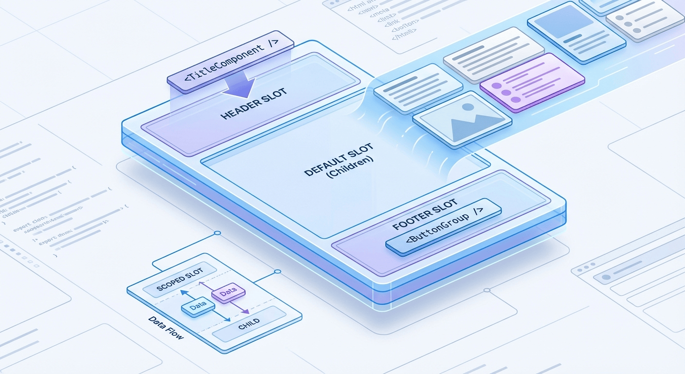
Trend 4: "Headless" Component Architecture
Inspired by development trends (like Headless UI), design systems are moving toward separating Structure from Style.
Separating Structure from Style
Traditionally, you might make 50 variants of a "Card" component (Image Left, Image Top, No Image, With Button, etc.). The "Headless" approach uses Slots (or "component properties" that act as containers). You build one rigid "Card Shell" that handles padding, rounded corners, and shadow. Inside, you place a "Slot" instance that can be swapped for any content—a video player, a text block, or a list.
Benefits
- Drastic Reduction in Variants: You maintain 1 component instead of 50.
- Flexibility: Designers aren't blocked if they need a card with a slightly different layout; they just swap the slot content without breaking the master component.
Trend 5: AI-Assisted Documentation
Let's be honest: nobody likes writing documentation. In 2025, AI is doing the heavy lifting.
Automated Specs
New plugins and workflows allow AI to scan a selected component set and auto-generate:
- Usage Guidelines: "Use this button for primary actions only."
- Accessibility Tags: Automatically flagging contrast ratios and ARIA label requirements.
- Change Logs: Summarizing what changed between version 1.2 and 1.3.
This frees up your Design Systems team to focus on architecture and strategy rather than typing out "padding-left: 16px" for the hundredth time. Tools like StateBuilder automate the tedious work of generating component state specs, so your documentation stays current without manual updates.
Conclusion
The era of the "static sticker sheet" is dead. The best design systems of 2025 are living, breathing ecosystems that are connected to code, governed by data, and automated by AI.
If you want to future-proof your library:
- Migrate to Variables immediately.
- Audit your files using tools like the Component Auditor Toolkit to clean up the mess left behind by old habits.
- Connect to Code to ensure your design reality matches the user's reality.
The gap between design and development is closing. It’s time to build the bridge.
Tools for this workflow
Recommended BiblioKit Plugins
Learn
Design Ops Fundamentals
We built this evergreen mental model so designers, developers, and marketers can align design systems, handoff, implementation, launch, and campaigns.
Read the guideNext & previous
Before
The Complete Guide to Design Systems in Figma (2026 Edition)
Upgrade Figma design systems for 2026 with variable-first architecture, AI cleanup, and Code Connect to scale without drift.
Design Systems • 6 min read
Next
The Ultimate Figma Plugin Stack: 8 Tools to Save You Hours Every Week
Install 8 Figma plugins that cut renaming, cleanup, and docs time so your team saves hours every week.
Figma Plugins • 4 min read
Related articles
Streamlining Your Figma Workflow with Automation Tools
Automate Figma renaming, audits, states, tables, and cleanup so your team ships faster each sprint.
Figma Plugins • 5 min read

Effortless Table Design in Figma: A Comprehensive Guide
Build scannable Figma tables fast with Auto Layout patterns that keep rows aligned.
UI Design • 4 min read
BiblioKit's Table Design Guide: Fix Auto-Layout & Align Data
Use Auto Layout to align Figma tables, reduce rework, and ship cleaner dashboards.
UI Design • 6 min read