
Effortless Table Design in Figma: A Comprehensive Guide
Introduction
Designing tables in Figma used to be a nightmare of manual resizing and broken layouts. If you’ve ever had to resize a column only to spend the next ten minutes adjusting every single row individually, you know the pain.
But with the power of modern Auto Layout, creating tables can be flexible, responsive, and—dare we say it—effortless. In this guide, we’ll walk through a method to build tables that resize automatically, support easy content updates, and maintain pixel-perfect consistency using a component-first approach.
The Problem with Traditional Tables
Historically, designers built tables by grouping rectangles and text layers. This "flat" approach meant that:
- Changing column widths required moving every element in that column manually.
- Adding rows meant reshuffling the entire canvas.
- Responsive design was non-existent; you had to rebuild the table for different screen sizes.
The solution is to use Auto Layout to mimic the way HTML tables work (<tr> and <td>), treating the table as a nested system of frames.
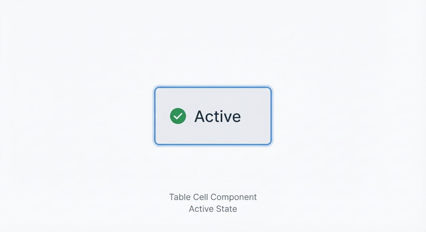
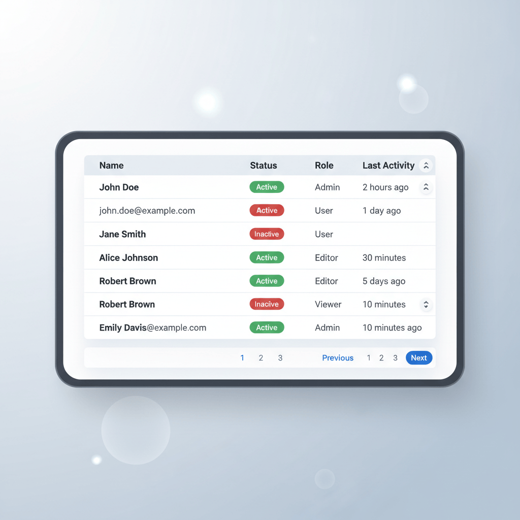
Step 1: The Atomic Cell Component
Everything starts with a single cell. Instead of building rows immediately, we create a master Cell Component. This ensures that if you want to change the padding or text style later, you only have to update it in one place.
Creating the Base Cell
- Text Layer: Start with a text layer (e.g., "Cell Content").
- Auto Layout: Press Shift + A to wrap it in an Auto Layout frame.
- Padding: Set your horizontal and vertical padding (e.g., 16px horizontal, 12px vertical).
- Resizing: Set the text layer to Fill Container and the frame width to Fixed (initially) or Fill Container depending on usage.
- Component: Turn this frame into a Component named Table / Cell.
Pro Tip: Use Component Properties (Booleans) to toggle visibility for icons or different text alignments (Left, Center, Right).
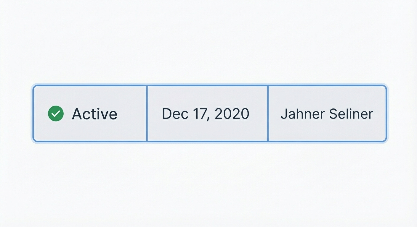
Step 2: Building the Row
Once you have your cell, you can build a row. A row is simply a horizontal stack of cells.
- Instance: Drag an instance of your Table / Cell component onto the canvas.
- Duplicate: Duplicate it 4-5 times for the number of columns you need.
- Auto Layout: Select all instances and press Shift + A to create a Horizontal Auto Layout frame.
- Naming: Name this frame Row.
- Resizing: Set the spacing between items to 0px (or -1px if handling borders, see below).
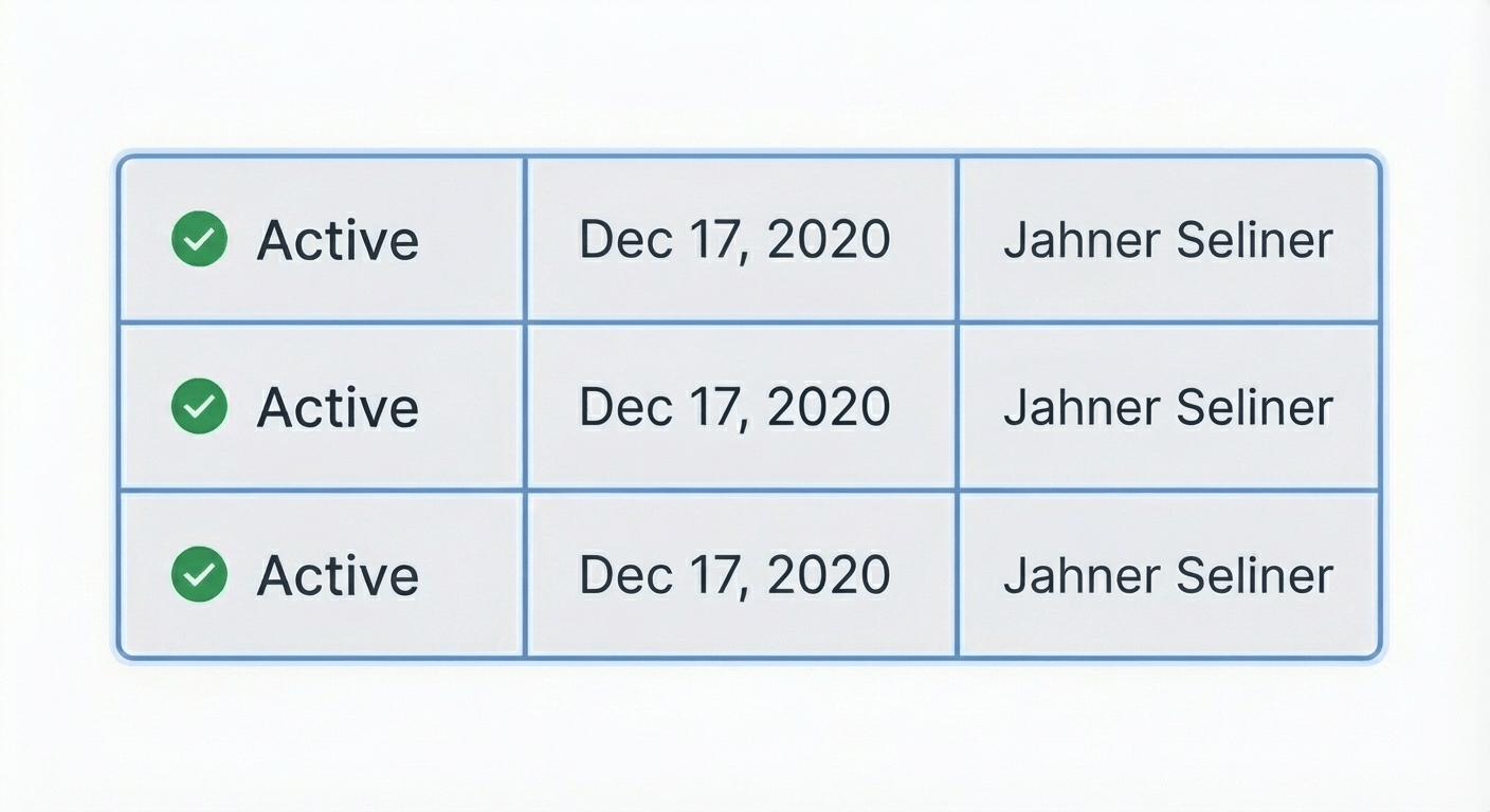
Step 3: Assembling the Table
Now, stack your rows to create the full table.
- Duplicate Rows: Select your Row frame and duplicate it for as many data entries as you need.
- Auto Layout: Select all rows and add Vertical Auto Layout.
- Container: This new frame is your Table.
- Styling: Add a stroke/border to the Table frame and set the corner radius if desired.
Handling Borders and Separators
One of the trickiest parts of table design in Figma is preventing double borders (where two cells meet and their borders combine to become 2px thick instead of 1px).
There are two main ways to handle this:
- The Negative Spacing Method: Set your Auto Layout spacing to -1px. This overlaps the borders so they sit perfectly on top of each other.
- The Stroke Per Side Method: Only apply borders to the bottom and right of your cell component. Then, apply a top and left border to the main Table container to close the loop.
Responsive Behavior (The "Effortless" Part)
To make the table truly responsive, you must adjust the resizing constraints of your hierarchy:
- The Table Frame: Set to Fixed Width (or Fill Container if inside a page layout).
- The Row Frames: Set their width to Fill Container. This ensures that if the table gets wider, the rows stretch with it.
- The Cell Instances: Select the cells inside the rows.
- For fluid columns: Set them to Fill Container. They will divide the available space equally.
- For fixed columns (like an ID or Checkbox): Set them to Fixed Width.
Advanced: Header Components
A proper table usually needs a header row that looks different from the body rows.
- Create a Variant of your Table / Cell component called Type = Header.
- Style it with a darker background or bolder text.
- In your top row, swap the cell instances to the Header variant.
Conclusion
By investing a few minutes to set up a robust Cell component and understanding the nested Auto Layout structure (Cell → Row → Table), you save hours of future maintenance. Your tables are now drag-and-drop ready, fully responsive, and effortless to update.
While building these manually gives you great control, you can supercharge your productivity by using BiblioTable to automate the alignment and structure of your Figma tables.
Learn
Design Ops Fundamentals
We built this evergreen mental model so designers, developers, and marketers can align design systems, handoff, implementation, launch, and campaigns.
Read the guideNext & previous
Before
Streamlining Your Figma Workflow with Automation Tools
Automate Figma renaming, audits, states, tables, and cleanup so your team ships faster each sprint.
Figma Plugins • 5 min read
Next
BiblioKit's Table Design Guide: Fix Auto-Layout & Align Data
Use Auto Layout to align Figma tables, reduce rework, and ship cleaner dashboards.
UI Design • 6 min read
Related articles
Mastering UI Component States: Your Secret Weapon for Awesome UI
Master UI component states so interfaces feel reliable, accessible, and consistent.
UI Design • 8 min read

BiblioKit 2026: Master Figma Auto Layout Wrap for Responsive Designs
Master Figma Auto Layout Wrap so responsive components stay intact without layout bugs.
Figma Plugins • 4 min read

How to Find and Fix Detached Instances in Figma (2026 Guide)
Spot detached instances fast so Figma systems stay linked without drift.
Figma Plugins • 7 min read