BiblioKit's Table Design Guide: Fix Auto-Layout & Align Data
Ever feel like tables are the unsung heroes of UI design? They might not have the flashy appeal of a hero banner, but let's be real: tables are the backbone of how we present complex data. Without them, deciphering information would be a nightmare.
Here's the thing about tables: they're everywhere. From dashboards to e-commerce orders, they're how users process crucial information. That's why designing them effectively isn't just nice-to-have; it's absolutely essential for readability, a smooth user experience, and actually helping people understand what they're looking at.
Core Principles of Effective Table Design
So, how do we make tables work for us, not against us? It all starts with a few core principles that guide great table design.
Readability and Scannability
First up: can people actually read this thing? Typography choices, the amount of space between elements, and even subtle color cues all play a massive role. Good spacing, for instance, prevents data points from feeling jammed together and overwhelming.
Hierarchy and Structure
Think about how your eye naturally moves. Clear headers, distinct rows, and well-defined columns create a visual hierarchy that tells users what's most important. Without a good structure, a table just looks like a confusing wall of text and numbers.
Consistency
This one's a biggie. Imagine different tables on your site looking completely different. Yikes! Maintaining consistent visual standards across all your designs means users don't have to relearn how to interpret data every time. It builds trust and familiarity.
Accessibility
We can't forget accessibility. Tables need to be usable by everyone. This means following WCAG guidelines, ensuring proper semantic structure, and making sure elements like headers are correctly identified for screen readers. It's not just good practice; it's the right thing to do.
Common Challenges in Table Layout & Data Alignment
Even with those principles in mind, designing tables often feels like a constant battle. Especially when you're dealing with real-world data.
One major headache is managing large datasets. How do you present hundreds or thousands of rows without completely overwhelming your users? Scrolling forever isn't usually the best answer.
Then there's the beast of responsive design. How does a complex table magically adapt to a tiny phone screen without breaking? It's a puzzle that many designers struggle with daily.
The Notorious Auto-Layout Headaches
But perhaps the biggest, most soul-crushing problem for designers using tools like Figma? Auto-layout. Oh, auto-layout.
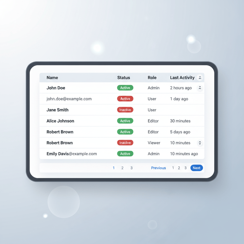
You know the drill: inconsistent spacing, data that just won't align perfectly, and scaling issues where one content change throws everything out of whack. It's like trying to herd cats. Maintaining cell integrity – ensuring that each cell holds its own and doesn't get squished or stretched unexpectedly – feels like a constant fight against the very tools meant to help us.
Strategies for Streamlining Table Design Workflow
Okay, enough commiserating. Let's talk solutions. How do we make this whole table-design thing less painful?
A huge step is leveraging design systems and components. Building reusable table components means you only have to solve those auto-layout puzzles once. Then, you can just drop in your pre-configured table component and swap out the data. Sweet, right?
Thinking about how you structure your data before you design can save a ton of time. Grouping related information logically helps both you and your users.
For responsive tables, think beyond just simple scaling. Techniques like horizontal scrolling for less critical columns, collapsing rows into expandable details, or even transforming rows into individual "card" layouts for mobile can make a world of difference.
And don't forget visual hierarchy and information grouping. Use subtle background colors, bolder text for headers, or alternating row colors to make the data easier to scan and understand at a glance.
Tools and Plugins for Flawless Table Creation & Management
Modern design tools like Figma, Sketch, and Adobe XD all offer robust auto-layout and component features. They're powerful, but let's be honest, getting them to play nice with complex table structures can still feel like rocket science sometimes.
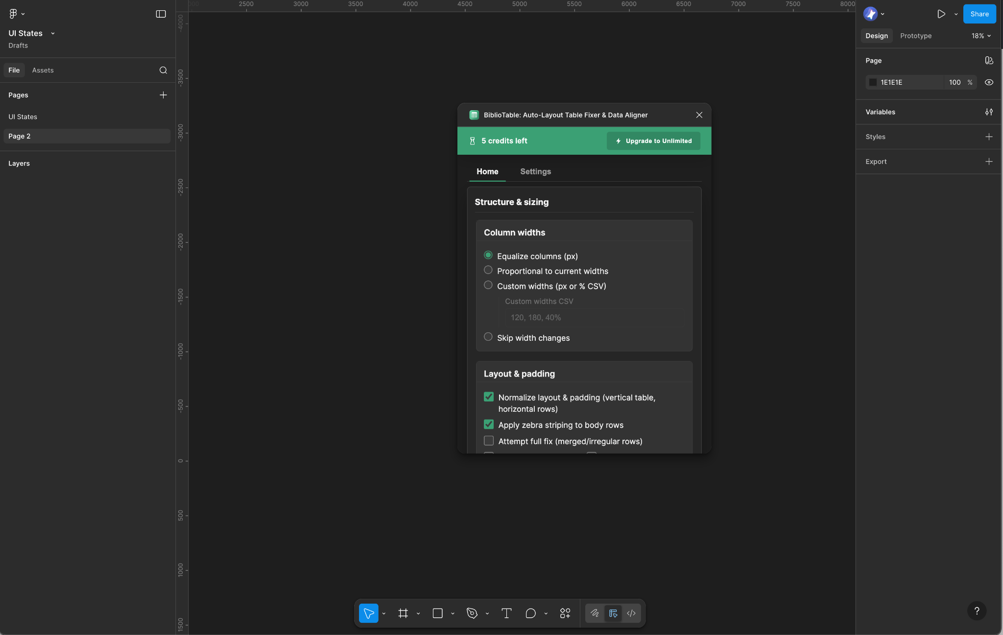
This is where a little help from the community comes in handy. If you've been tearing your hair out over misaligned cells and endless manual adjustments, you absolutely need to check out the FixTable Auto-Layout Table Fixer & Data Aligner.
This Figma plugin is a game-changer because it's built specifically to solve those common auto-layout and data alignment problems we just talked about. Instead of fiddling with individual cell constraints for ages, FixTable swoops in to automate spacing, ensure perfect alignment, and even help with responsive adjustments.
Imagine a world where your table cells just... work. This plugin aims to give you that by letting you set up your table structure and then letting it do the heavy lifting of keeping everything tidy. It means less time debugging your auto-layout stack and more time focusing on the actual user experience. If you want to boost your design efficiency and get rid of those table headaches, this tool is definitely worth adding to your Figma arsenal. Find it here: FixTable Auto-Layout Table Fixer & Data Aligner.
Advanced Table Features & Interactions
Beyond the basics, tables can offer some pretty neat interactions that make them even more powerful.
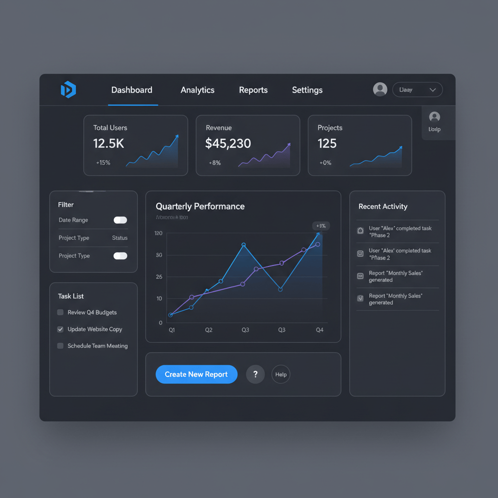
Think about sorting and filtering options. Allowing users to quickly reorder data by date, name, or value, or filter out irrelevant information, makes a table incredibly useful.
Pagination versus infinite scroll is another hot topic. For massive datasets, pagination gives users a sense of control and prevents endless scrolling, while infinite scroll works great for exploratory data.
You can also include inline editing, where users can directly modify data within the table itself. This is fantastic for boosting productivity in admin panels or dashboards. And simple things like hover states or selection feedback make tables feel more dynamic and responsive to user input.
Conclusion: Elevate Your Data Presentation with Smart Table Design
So, what's the big takeaway here? Tables are more than just grids; they're critical tools for data comprehension and user experience. Getting them right means paying attention to readability, hierarchy, consistency, and accessibility.
And let's not forget tackling those frustrating auto-layout issues head-on. By applying smart design principles, leveraging component-based workflows, and using helpful tools like the FixTable Auto-Layout Table Fixer & Data Aligner, you can elevate your data presentation from clunky to flawless.
Ultimately, well-designed tables aren't just about making things look pretty. They're about empowering users, reducing friction, and making complex information digestible. So go forth and design some truly awesome tables! Your users (and your sanity) will thank you.
Tools for this workflow
Recommended BiblioKit Plugins
Learn
Design Ops Fundamentals
We built this evergreen mental model so designers, developers, and marketers can align design systems, handoff, implementation, launch, and campaigns.
Read the guideNext & previous

Before
Effortless Table Design in Figma: A Comprehensive Guide
Build scannable Figma tables fast with Auto Layout patterns that keep rows aligned.
UI Design • 4 min read
Next
Mastering UI Component States: Your Secret Weapon for Awesome UI
Master UI component states so interfaces feel reliable, accessible, and consistent.
UI Design • 8 min read
Related articles

BiblioKit 2026: Master Figma Auto Layout Wrap for Responsive Designs
Master Figma Auto Layout Wrap so responsive components stay intact without layout bugs.
Figma Plugins • 4 min read

How to Find and Fix Detached Instances in Figma (2026 Guide)
Spot detached instances fast so Figma systems stay linked without drift.
Figma Plugins • 7 min read

Remove Figma Prototype Links: A Guide by BiblioKit (2026)
Remove Figma prototype links safely so you share the right build without broken flows.
Figma Plugins • 6 min read