UI Design
Mastering UI Component States: Your Secret Weapon for Awesome UI
You know that feeling when you interact with an app or website, and everything just... works? It feels intuitive. You click something, and it reacts. You hover, and it shows you it's clickable.
That's not magic, my friend. That's the power of UI component states.
1. Introduction: The Dynamic World of UI Component States
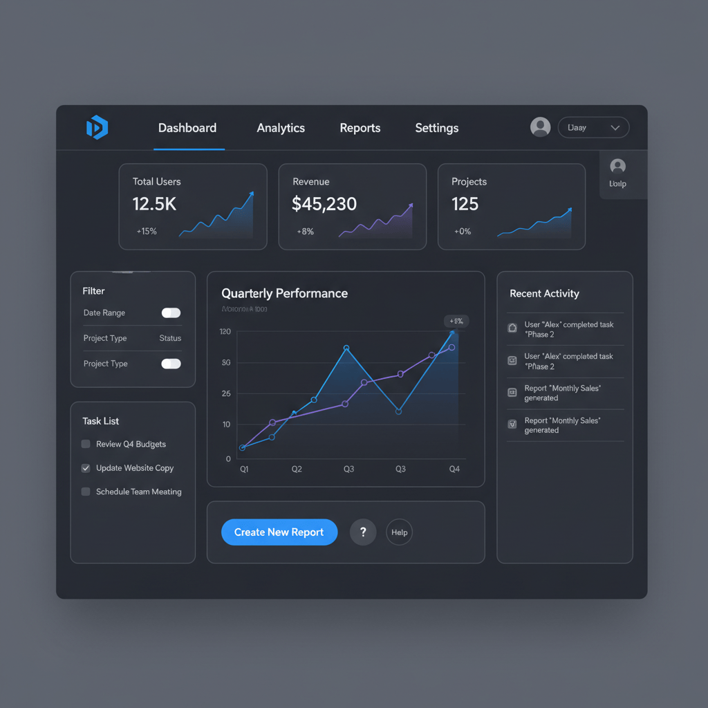
Here's the thing: user interfaces aren't static pictures. They're living, breathing ecosystems that respond to human touch, clicks, and even keyboard taps. UI component states are simply how these individual elements - think buttons, input fields, or checkboxes - change their appearance and behavior based on what the user is doing, or what the system is up to.
They are like tiny silent conversations happening between your product and its users. Understanding these states is not just a nice-to-have; it is fundamental for crafting experiences that feel intuitive, helpful, and not frustrating.
In this guide, we are going to pull back the curtain on these unsung heroes of UI design. We will start with the humble button and then branch out, showing you how thoughtful state management can elevate your designs.
2. The Importance of Component States in UI Design
Why should you care so much about something as seemingly small as a button's hover state? It makes a huge difference.
Enhancing User Experience
Imagine clicking a button and nothing happens visually. You would probably click it again or wonder if it is broken. States prevent that confusion. They provide instant feedback, letting users know their actions are registered, what is interactive, and what they can expect next. This clarity builds trust.
Improving Accessibility and Inclusivity
Good design is for everyone. Component states play a massive role in accessibility, especially for users who rely on keyboard navigation. A clear focus state tells a keyboard user exactly where they are on the page. Without these visual cues, many users would find your interface incredibly difficult to use.
Ensuring Consistency
Think about your favorite apps. Do their buttons look and behave differently on different screens? Probably not. Consistent states mean users learn how to interact with one part of your product and can apply that knowledge everywhere else. It reduces cognitive load.
Streamlining Development Hand-off
When you hand off your designs to developers, well-defined component states are a godsend. They spell out exactly how each element should look in every scenario, reducing assumptions and making the build process faster.
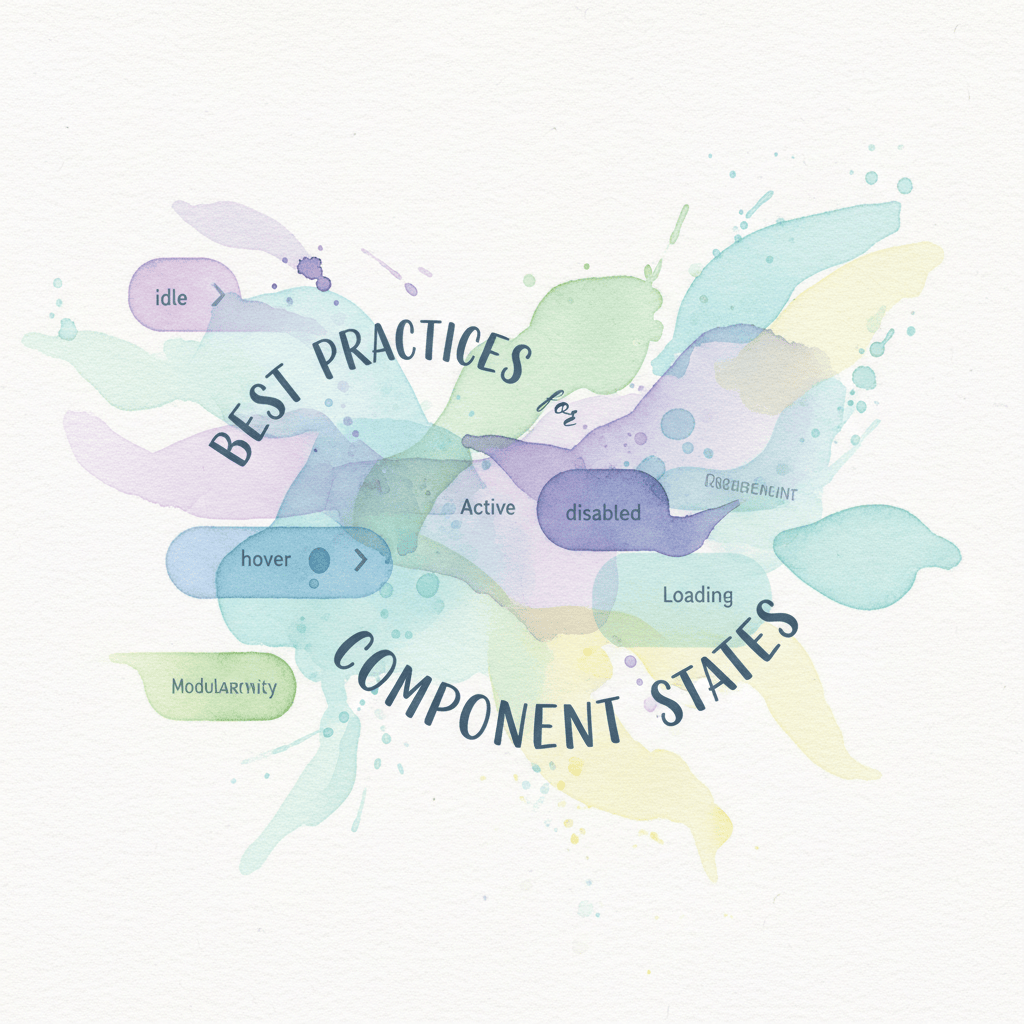
3. Deep Dive into Button States
Buttons are the workhorses of any UI. Mastering their states is like learning the alphabet of user interaction.
- Normal/Default State: Your button at rest, waiting for interaction.
- Hover State: Signals "I am interactive" with a slight color shift or elevation shadow for discoverability.
- Active/Pressed State: Immediate feedback during click that confirms engagement.
- Focus State: A prominent outline or halo when tabbed to via keyboard so users know exactly where they are.
- Disabled State: A clear visual dead end (often reduced opacity) to prevent frustrating clicks on inactive elements.
- Loading State: A spinner or dimmed state to manage expectations and prevent double-clicking during work.
4. Expanding Beyond Buttons
The principles above are not just for buttons. Almost every UI element lives multiple lives.
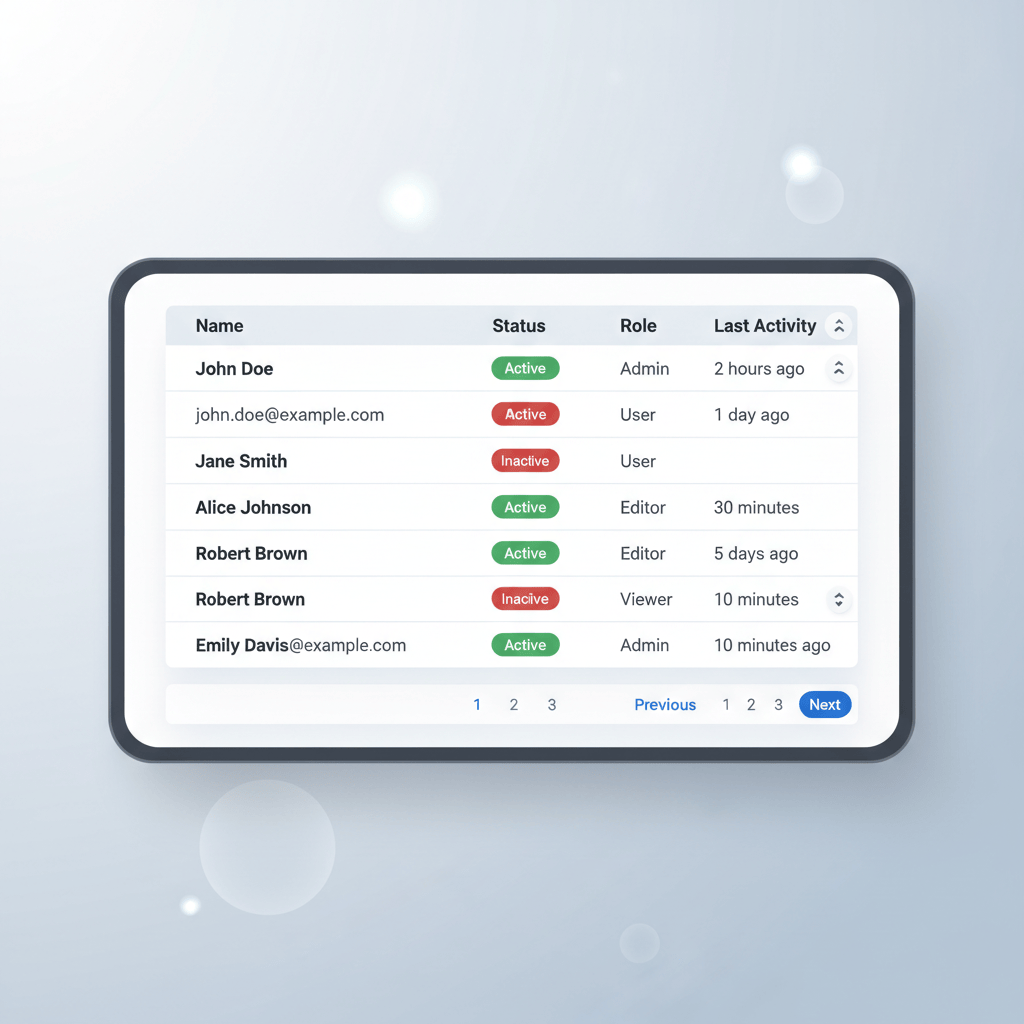
- Input Fields: Default, focus with a highlighted border, active or filled, error with a message, and success.
- Checkboxes and Radios: Unchecked, checked, and the tricky indeterminate state for partial selections.
- Dropdowns: Closed versus open.
- Cards: Often have hover lifts or selected states.
5. Designing and Documenting Component States Effectively
You get why states matter. Now, design and manage them without pulling your hair out.
- Visual Cues: Use subtle shifts in color, typography, or iconography. Stay consistent - do not use red for success in one place and error in another.
- Microinteractions: A gentle fade or springy bounce can turn a clunky click into a delightful moment.
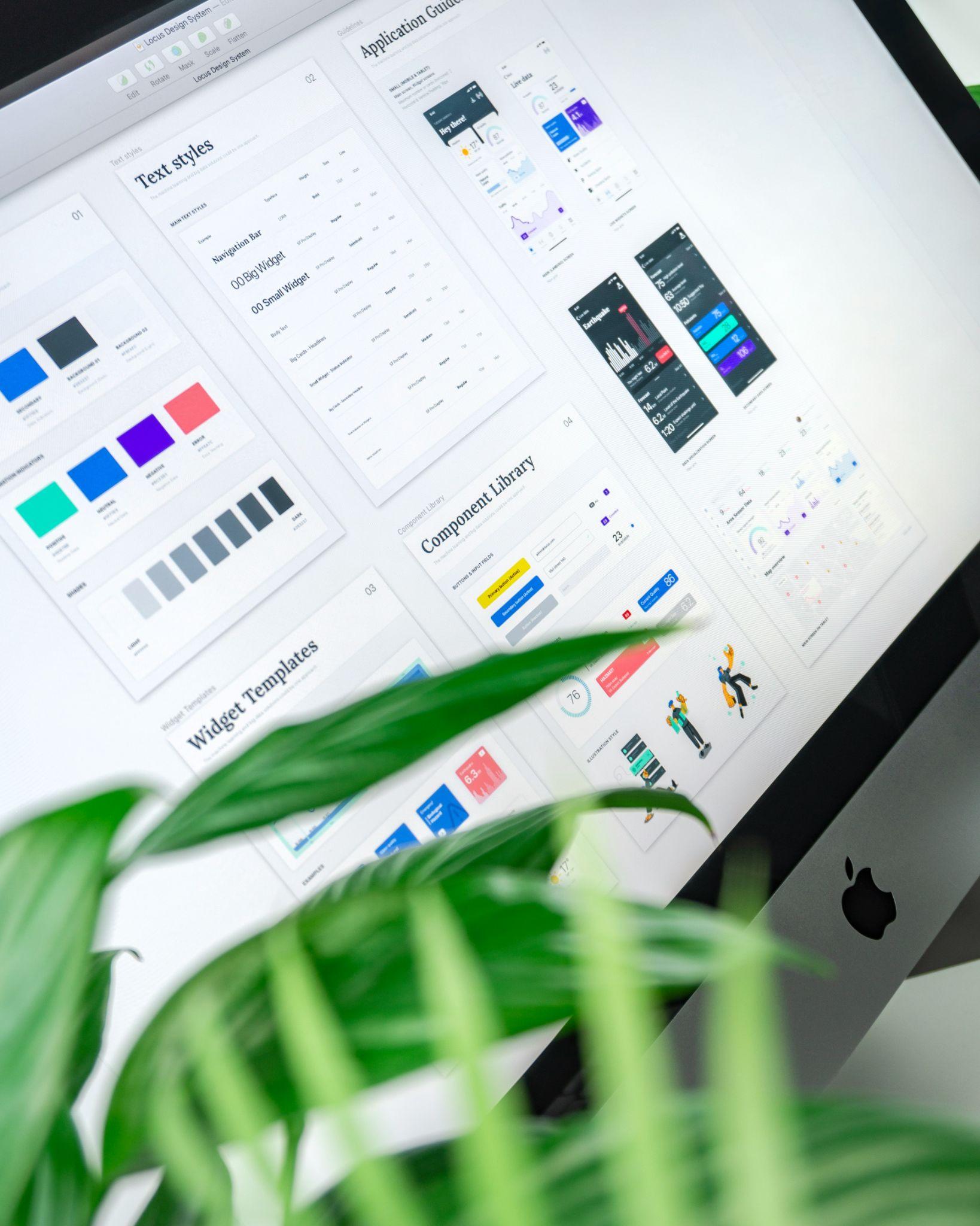
- Building a Design System: Establish clear rules so your system is the single source of truth for every state.
6. Maintaining Design System Consistency and Health
Design systems can get messy. As teams move fast, one-off components creep in and drift from the standard.
Ensuring component states stay correct and up to date is a continuous challenge that takes vigilance and the right tools.
The "Detached Instance" Nightmare
In tools like Figma, a detached instance breaks the link to the master component. Updates to the main component will not apply, and inconsistencies multiply over time.
How to Fix It (Without Losing Your Mind)
Finding and managing these rogue elements is critical for a healthy system. Use BiblioAudit: Find Detached Instances and Design System Check to scan files, reattach instances, and fix drift before it hits development.
Automating the Documentation Gap
Documentation is usually the first thing skipped under deadline. Instead of manually writing every hover, focus, and error state, use BiblioStates: Component State Generator and Specs to auto-generate visual states and documentation cards for engineers.
7. Best Practices for Implementing Component States
Here is the actionable short list to keep your UI sharp.
- Prioritize clarity: if a state does not make the user's life easier, rethink it.
- Accessibility is mandatory: consider keyboard users and screen readers and test focus states rigorously.
- Use purposeful motion: keep transitions smooth and fast enough to avoid jank.
- Test on real devices: what looks fine on a 4K monitor might be invisible on a phone in sunlight.
- Iterate: your design system should evolve alongside your product.
8. Conclusion: Elevating User Experiences
Well-defined, consistently applied component states are the bedrock of dynamic, user-friendly interfaces. They orchestrate seamless user journeys.
By mastering state management and using the right tools to maintain it, you are making experiences understandable, accessible, and enjoyable. Pay attention to the subtle shifts and clear outlines - your users and developers will thank you.
Learn
Design Ops Fundamentals
We built this evergreen mental model so designers, developers, and marketers can align design systems, handoff, implementation, launch, and campaigns.
Read the guideNext & previous
Before
BiblioKit's Table Design Guide: Fix Auto-Layout & Align Data
Use Auto Layout to align Figma tables, reduce rework, and ship cleaner dashboards.
UI Design • 6 min read
Next
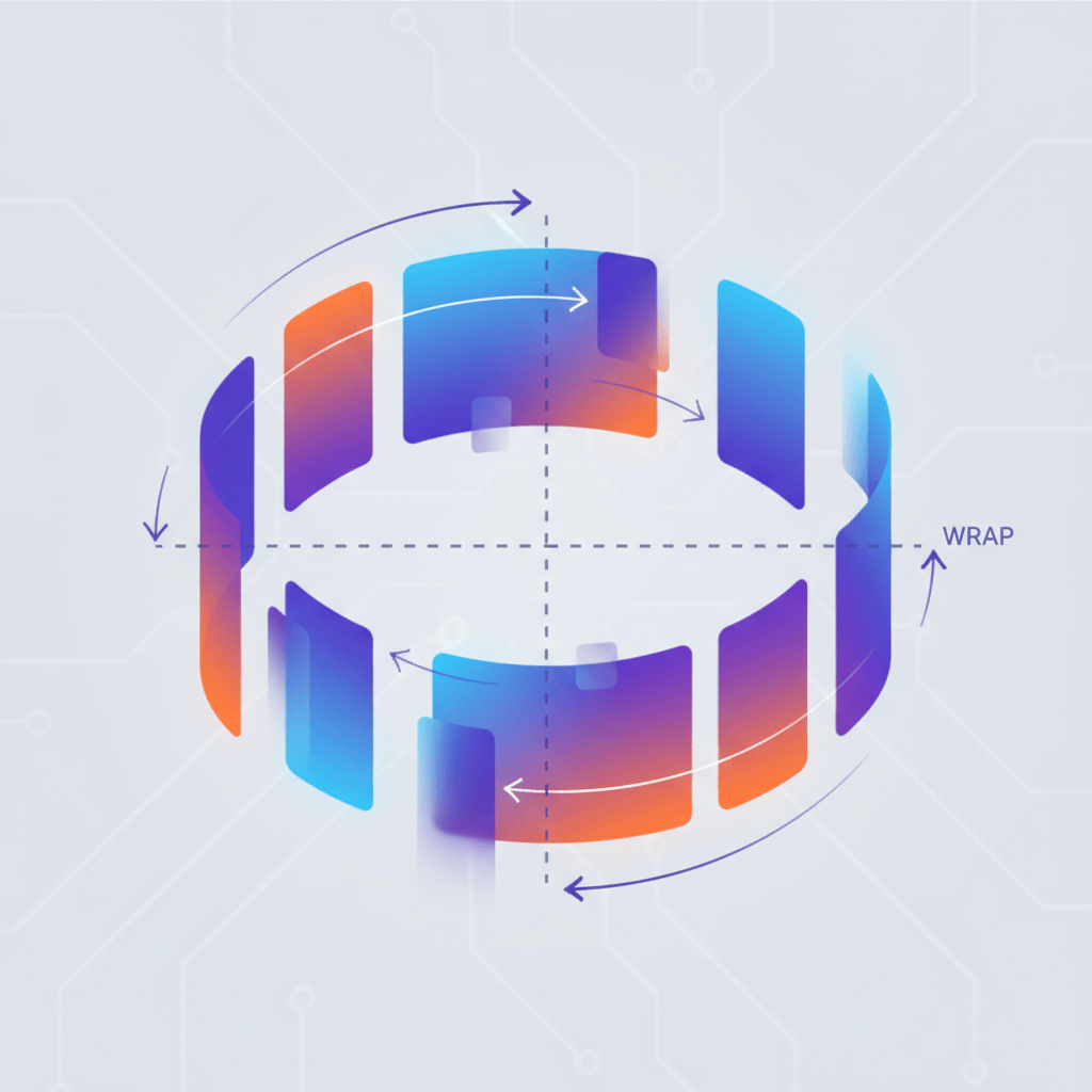
BiblioKit 2026: Master Figma Auto Layout Wrap for Responsive Designs
Master Figma Auto Layout Wrap so responsive components stay intact without layout bugs.
Figma Plugins • 4 min read
Related articles
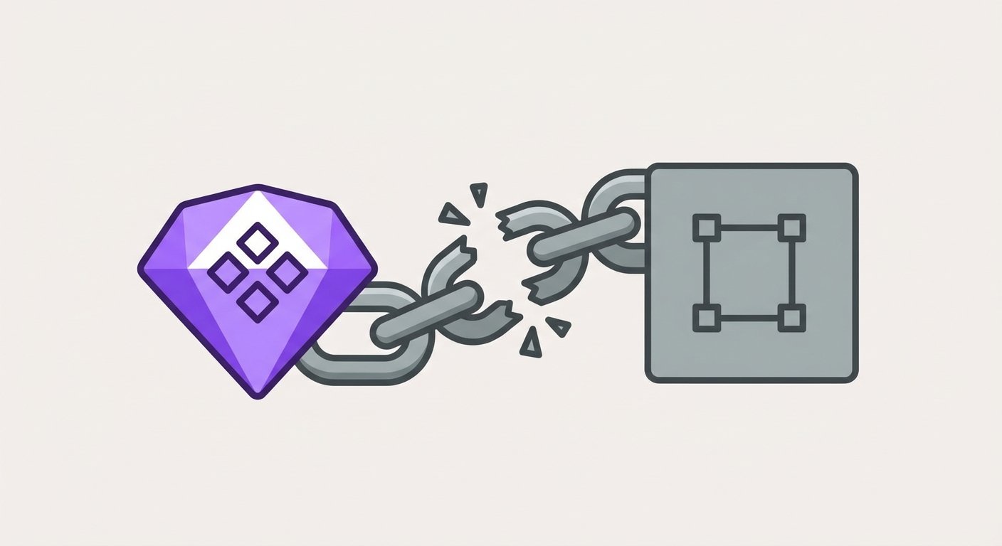
How to Find and Fix Detached Instances in Figma (2026 Guide)
Spot detached instances fast so Figma systems stay linked without drift.
Figma Plugins • 7 min read

Remove Figma Prototype Links: A Guide by BiblioKit (2026)
Remove Figma prototype links safely so you share the right build without broken flows.
Figma Plugins • 6 min read
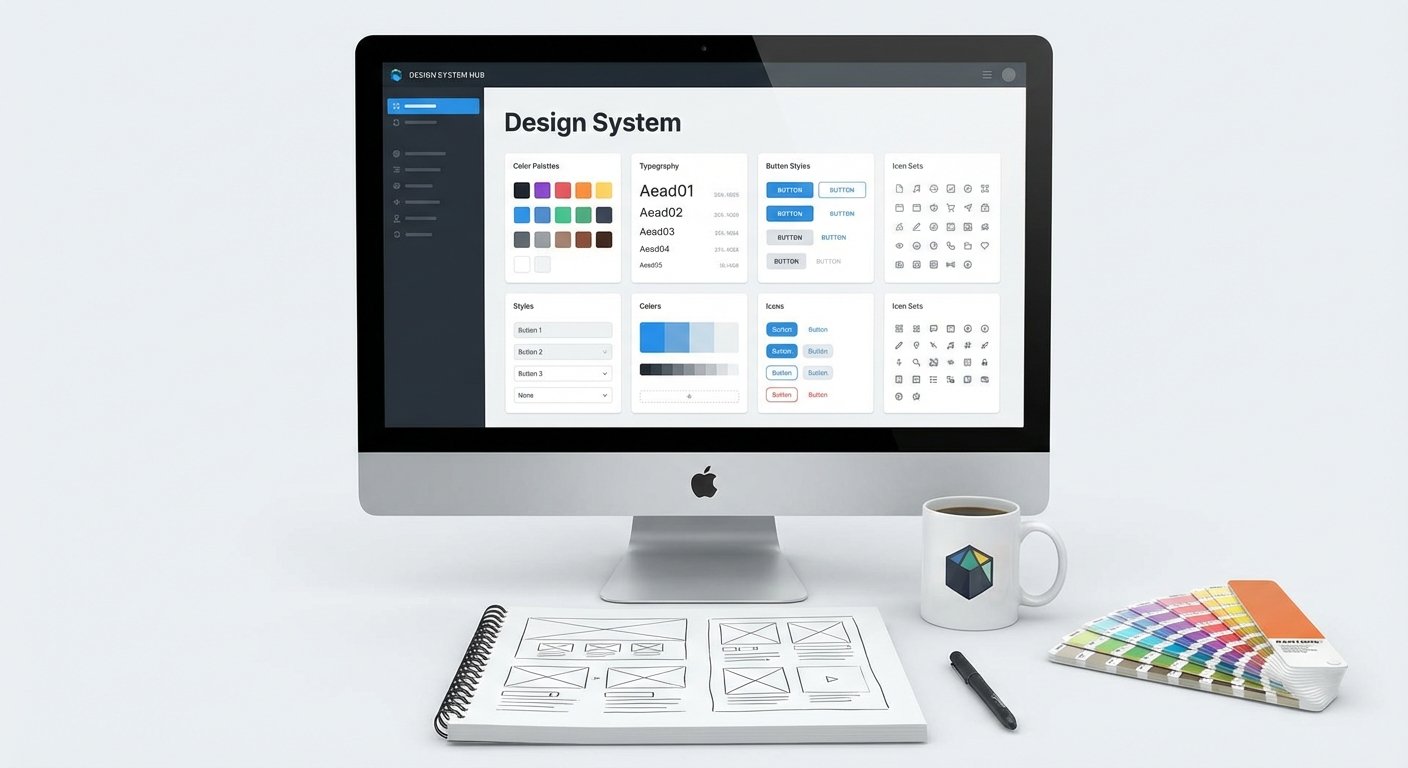
Best Practices for Effective Design System Guidelines
Build design system guidelines that keep components consistent and shipping speeds up.
Design Systems • 9 min read