The world of design systems is no longer just about "components" and "libraries"—it's about building intelligent, connected infrastructure. By 2026, the "System-as-Product" mindset has fully matured, and Figma has evolved its platform to match.
For design system maintainers, 2026 marks the shift from static sticker sheets to variable-driven logic that mirrors production code. Whether you are auditing a legacy system or building a new one from scratch (use OrganizeFile to scaffold your file structure), this guide covers the essential architecture, workflows, and tooling you need to stay competitive.
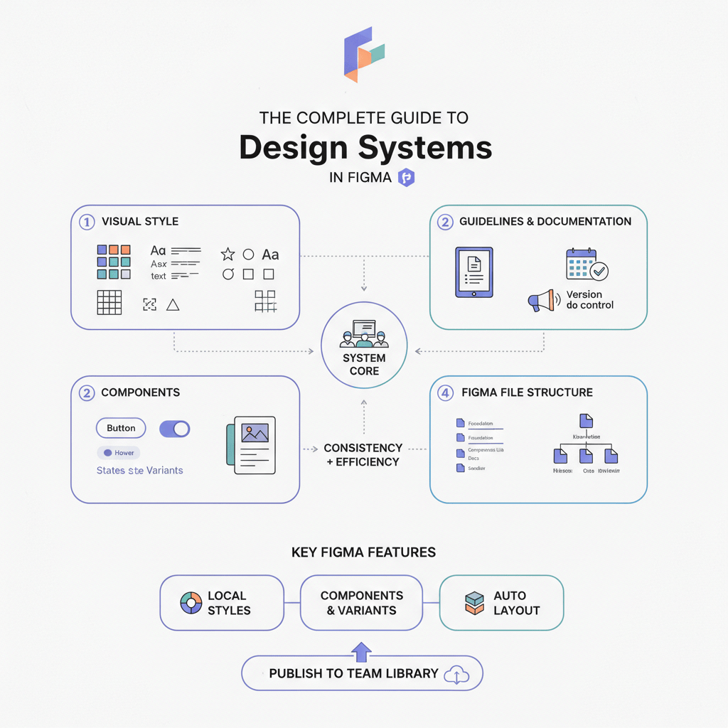
The Complete Guide to Design Systems in Figma (2026 Edition)
The New Era of System Design
The biggest immediate change for any designer entering 2026 is the UI3 redesign. While the journey to this interface involved some experimentation with floating panels, the stable 2026 release has settled on a configuration that maximizes canvas space while retaining familiar anchors.
Key UI3 features for system maintainers include:
- The Bottom Toolbar: A centralized "floating" hub that brings key actions closer to the user’s focal point.
- Resizable Panels: The ability to dynamically adjust the width of the properties and layers panels allows for better visibility of deep nesting in complex component sets [1].
- Modernized Layout: A cleaner, less dense interface designed to reduce cognitive load during heavy documentation sessions.
But the interface is just the wrapper. The real shift in 2026 is structural: we are moving away from maintaining purely visual assets and toward maintaining logic.
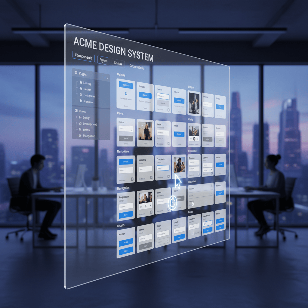
2. The ROI of Modern Design Systems
If you are struggling to get buy-in for a system overhaul, the data is now undeniable. In 2023, we relied on anecdotes; in 2026, we have hard numbers.
- 135% ROI: Recent studies by Reloadux report that companies see a return on investment of up to 135% within just a few years of implementing a robust design system [2].
- Cost Reduction: Forrester and Medium analysis indicates a 30–50% reduction in design and development costs for teams using mature systems [3].
- Adoption is Standard: The "Supernova State of Design Tokens 2024" report found that 69.8% of respondents have already migrated to Figma Variables for their token management, signaling that "variables" are no longer an advanced feature—they are the industry standard [4].
3. Core Architecture: Variables & Tokenization
The "Styles" panel is taking a backseat. The most robust systems in 2026 are built almost entirely on Figma Variables.
Beyond Colors: The Rise of Logic
While 74% of teams use variables for theming (light/dark modes), the real power users are leveraging them for Typography.
- Typography Variables: You can now bind font families and weights to string variables and font sizes/line heights to number variables. This allows you to switch a single variable (e.g., brand-font) and update the entire system's typeface instantly—something that was impossible with old text styles [7].
Extended Collections & Modes
With increased mode limits, 2026 systems often use "multi-brand" architecture within a single file. A common structure involves:
- Primitive Collection: Raw hex codes and pixel values.
- Semantic Collection: text-primary, surface-success (referencing primitives).
- Component Collection: button-radius, card-padding (referencing semantics).
4. AI-Powered System Management
"Design Debt"—the accumulation of unnamed layers, detached instances, and inconsistent naming—is the enemy of scalability. Figma’s 2026 AI suite offers direct tools to combat this.
- Automated Maintenance: The days of manually renaming "Frame 428" are over. Figma AI can now contextually rename layers in bulk, ensuring your file structure is clean before handoff [5].
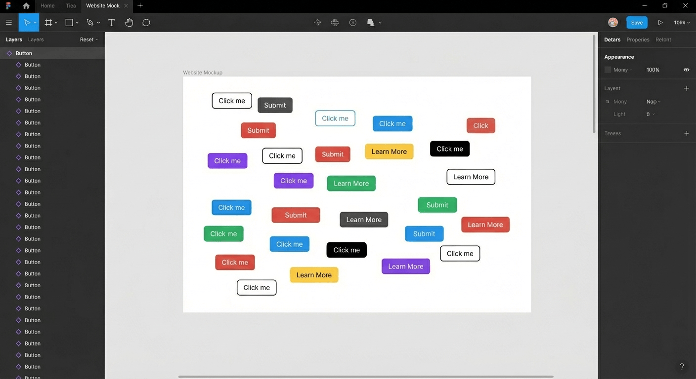
- Visual Search: To prevent component duplication, the Visual Search feature allows designers to upload a screenshot or select a layer to find visually similar existing components in the library. This drastically reduces the "I didn't know we already had a card for that" problem.
- First Draft (formerly "Make Designs"): While not a replacement for system design, the First Draft feature (an evolution of the "Make Designs" prompt) allows you to rapidly generate UI patterns to test against your system tokens before standardizing them.
Recommended Tool:
StateBuilder: Component State Generator Even with AI, missing states are a common pain point. This community favorite automatically generates missing component states (hover, focus, disabled) based on your core variant, ensuring your component sets are complete.
5. Bridging the Gap: Dev Mode & Code Connect
The "handoff" phase has been replaced by continuous synchronization. The 2026 standard is Code Connect.
- Code Connect: This feature allows you to link your Figma components directly to your production code (React, Swift, Android). When a developer inspects a button in Dev Mode, they don't see auto-generated CSS; they see the actual React component code from your repository.
- Result: Developers can copy-paste production-ready snippets rather than guessing at implementation [6].
- Dev Efficiency: Teams utilizing these integrated workflows are seeing a 30% time recovery for developers, who no longer have to translate generic design specs into component props [3].
6. Documentation & Governance
Static documentation sites are becoming less common. In 2026, documentation lives where the work happens.
- Interactive Docs with Figma Slides: Figma Slides has emerged as a surprising powerhouse for system docs. You can embed live, interactive prototypes of your components directly into a slide deck. When the system updates, the documentation updates automatically.
- Governance: Using "Ready for Dev" statuses is critical. It signals to engineers which parts of the file are stable and which are sandboxes.
Recommended Tool:
Component Auditor Toolkit Governance requires visibility. This plugin scans your files to find detached instances and overridden components, helping you identify where your system is breaking and where "design debt" is accumulating.
7. Conclusion: Upgrading to the 2026 Standard
If your system was built in 2023, it is likely due for a refactor. Use this checklist to upgrade:
- Migrate Styles to Variables: Start with colors, then move to radius and spacing (numbers), and finally typography.
- Implement Code Connect: Work with your engineering lead to map your top 20 core components to their repo counterparts.
- Clean Up with AI: Run a "Rename Layers" pass on your master component files.
- Audit Your Debt: Use the Component Auditor Toolkit to find where your team is detaching components and address the root cause.
The "System-as-Product" mindset means the work is never "done"—but with the right 2026 architecture, it can finally be manageable.
________________
References
- [1] Figma UI3 Release Notes & Interface Documentation
- [2] Reloadux 2024 Design System ROI Study
- [3] Forrester / Medium Analysis on Design System Efficiency
- [4] Supernova "State of Design Tokens 2024" Report
- [5] Figma AI Features Overview (Visual Search, Rename Layers)
- [6] Figma Code Connect Developer Documentation
- [7] Design Monks / Figma Updates on Typography Variables
Tools for this workflow
Recommended BiblioKit Plugins
Learn
Design Ops Fundamentals
We built this evergreen mental model so designers, developers, and marketers can align design systems, handoff, implementation, launch, and campaigns.
Read the guideNext & previous
Before
What is Design Ops? The Complete Guide
Build a Design Ops system that frees designers, developers, and marketers from busywork, aligns workflows, and speeds launches.
Design Ops • 5 min read
Next
The 2026 Shift: Bridging the Gap Between Design and Dev
Close the 2026 design-dev gap with five component library shifts that align tokens with production code.
Design Systems • 5 min read
Related articles
The Ultimate Figma Plugin Stack: 8 Tools to Save You Hours Every Week
Install 8 Figma plugins that cut renaming, cleanup, and docs time so your team saves hours every week.
Figma Plugins • 4 min read
Streamlining Your Figma Workflow with Automation Tools
Automate Figma renaming, audits, states, tables, and cleanup so your team ships faster each sprint.
Figma Plugins • 5 min read

Effortless Table Design in Figma: A Comprehensive Guide
Build scannable Figma tables fast with Auto Layout patterns that keep rows aligned.
UI Design • 4 min read